zuzu 2014
| rebrandingZuzu continued the product portfolio development to the extent that both the brand architecture and package design graphic system proved to be unable to accommodate the new product launches.
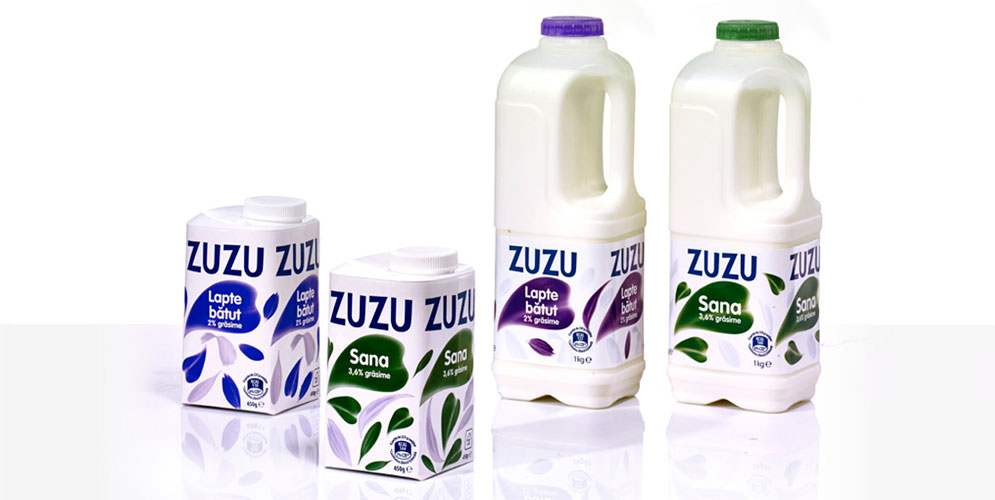
This situation triggered the need for a new extensive project on the brand – thus, we created a brand architecture based on product ranges according to consumption benefits. The products that Zuzu was initially famous for were gathered under the ‘origins’ range and kept their white background package design, while other products were organised according to their main benefits in the following categories: ‘active health’ – green background, ‘refresh’ – blue background and ‘creamy’ – crimson background.
Currently, the new graphic system makes the differentiation between products a lot more comprehensible and allows the brand to access a whole new array of sub-categories while preserving its design consistency.


